TASK 1 EXPLORATION

Design Principles - Task 1: Exploration
03/02/2025- 17/02/2025 / Week 1 – Week 3
Valenz Jycee Primadi / 0373407
Design Principles /Creative Media/ School of design
Task 1: Exploration
TABLE OF CONTENTS
1. Lectures
2. Instructions
3. Task : 1 Exploration (Part A)
4. Task : 1 Exploration (Part B)
5. Feedback
6. Reflection
-
Line: A line is a mark that can be made straight or curved, connecting from the first point to the second point. We can see lines in everyday life, for example, the yellow lines on the highway. It's very commonly used for design.

-
Shape: A shape is a 2-dimensional geometric shape with a certain width and height. Shapes are the most common shapes in everyday life; for example, we do learn shapes in kindergarten, but shapes can also be used to design as art.

-
Form: Forms are the same as shapes, but forms resemble a 3-dimensional space that has height, width, and depth. There's two types of design form, Geometric Form and Organic Form.

- Color : We are familiar with colors, there are red, green, yellow, blue, purple, pink, etc. But what is color actually? Color is light reflected on an object, which the eye will interpret based on the light hitting the object. This creates a color that we know today. There are 6 types of colors, namely, warm & cool colors, primary colors, secondary colors, tertiary colors, complementary colors, and analogous colors.

- Value : Apart from light and dark that we know, it turns out that light and dark are also used in the world of design, namely Value. Value is one of the elements about lightness or darkness of a color, and can add a dimension to a work. Artists can create light and dark (value) in a work in the form of lines through a technique called shading using different types of lines.

-
Space: Space is a distance in a room; space is also used in design as the distance and area around, between, and within the components of a design. There are two types of spacing. There are negative and positive spacings. Positive space is the main subject or focal point in a design. Negative space is the empty space around elements in a design.

-
Texture: Texture is the surface pattern of an object that can be felt and assessed with the senses of sight and touch, so texture can include visual characteristics. Texture is often categorized as the surface of an object, for example, the texture of walls, wood, marble, fabric, etc. The use of texture in design can add aesthetic value.

Now let's move on to design principles. From the explanation above, we already know about design principles. There are several principles contained in design; let's study them one by one:

Gestalt theory focuses more on how humans interpret an object as a whole, not just parts of it. This design principle can be applied in design (UI/UX) and also in logo creation; it can help create a more cohesive and relevant appearance for the audience.
- Principles of Proximity : Objects that are close to each other and can be said as one unit.

- Principles of Similarity: Objects that are similar so that they are grouped together and are considered to have a visual character indirectly create a common attachment. The more often an object appears, the more likely it is to be seen as a group.

- Principles of continuity: dictate the eyes to follow Straight or curved lines that tend to flow continuously and create effective information.

- Principles of closure: It turns out that closure has a relationship with the principle of continuity. Closure also invites the eye to complete a pattern so that our brain tries to find a pattern that can be understood.

- Figure/ground: This principle is a principle regarding the relationship between an object and the space surrounding it, for example, the moon in space. The moon represents positive space while the sky represents negative space. This meaning is the same as the design element, namely space; as has been discussed, there are two types of space, namely negative and positive space.

- Principles of Law of Symmetry and Order: The Law of Symmetry is what emphasizes human psychology: that humans naturally view everything as a whole or in balance.

Contrast has two important roles. First roles, contrast helps designers to make design elements stand out from each other. Fun fact The second role of contrast can help to increase accessibility for all people, including those with visual impairments, to help them understand better about the design, especially text and background.


For example, red among monochrome colors. Emphasis is created by distinguishing one element from another. These differences can occur in terms of size, color, texture, shape, and etc.

The Golden Ratio, also known as The Golden Mean, is represented by the Greek letter 'phi' (rational numbers are common in mathematics lessons). The golden ratio in design is a proportional ratio used to create harmonious and aesthetic proportions. The golden ratio is often found in nature, architecture, art, and design.

-
Symmetrical (formal): arrangement of design objects that are equal to each other on each side, between the left and right or top and bottom sides. So that the design looks symmetrical. For example, in graphic design, such as road signs and company logos.

-
Asymmetrical (informal) balance: different from symmetry, asymmetrical is the arrangement of objects or design elements that are not the same or not equal between each other's sides. Either the right and left sides or the top and bottom sides. The result is an asymmetrical design. For example, the well-known painting The Incredulity of Saint Thomas by Caravaggio.


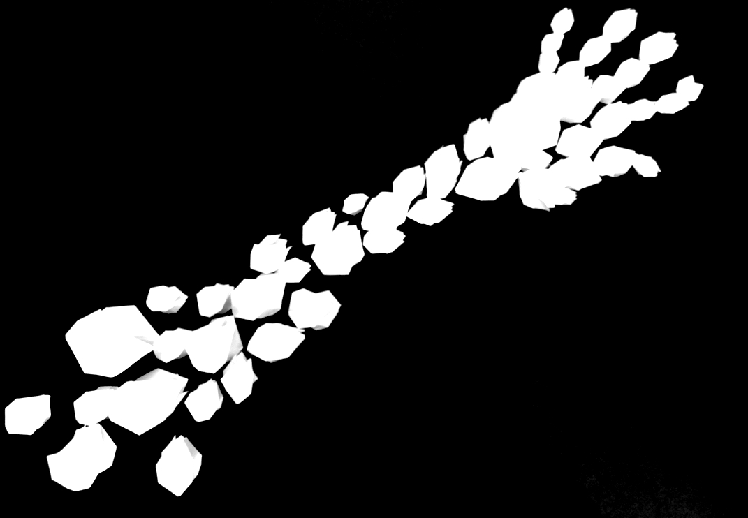
The principle of movement is a design principle that invites and directs the viewer's eye through the design composition. This aims to ensure that the message you want to convey can be conveyed well and precisely. As a good designer, we must be able to create control of the various elements that the viewer focuses on by placing them along the path of eye movement patterns.

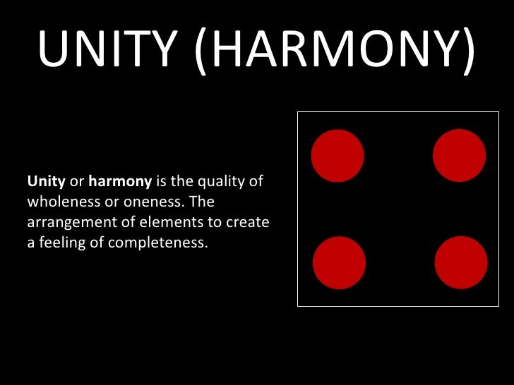
The principle of unity and also the principle of harmony make design elements create an atmosphere of completeness and also create a sense of unity and cohesiveness in a design work. In fact, both principles have the same meaning and have the same aim; it's just that harmony gives the design the impression of complementarity and unity in a work.

Examples of this principle include making posters and also
applying interior design; both of these designs give the
impression of unity of typography, images, and colors. Moreover,
the interior design of tables, chairs, and accessories gives the
impression of comfortable harmony. Unity gives the design a
sense of harmony.
Unity gives the design a sense of
harmony, both conceptually and visually. For example, in graphic
designs such as posters, the unity can be seen in typography,
images, and colors.

For example, the biohazard symbol, which is usually found in chemistry labs. The symbol shows how dangerous these chemicals are, so it tells visitors that they should be careful.
From the typography module, we are definitely familiar with words and images. Words and pictures is a visual typography that combines a word with an image to create meaning and also convey information, which makes it easier for the viewer to understand. The relationship between words and images is considered an important element of design.


-
Emphasis the electric chair is placed in the center of the composition as the main focal point. In this painting, negative space is created because the room is quiet and empty from the execution room, making the audience focus more on the electric chair.

-
Contrast this painting uses bright colors so that the colors stand out in people's eyes. These colors are red, yellow, orange, purple, pink, blue, or green. The colors used depict the electric chair, a cruel and frightening object; with the help of dark contrast, it makes the atmosphere more chilling. The color contrast creates a sense of unease and highlights the irony between bright pop aesthetics and dark death.

-
Repetion like other Andy Warhol works, the Electric Chair consists of several different color versions but with the same object. Warhol used silkscreen printing techniques. This repetition of different colors defines the way the mass media broadcast images of violence over and over again.
 figure 3.4 Repetion
 -
Balance in this painting, Warhol created a principle of asymmetrical balance in his composition. We can see the electric chair is placed slightly off-center; it helps to give a dramatic atmosphere rather than being placed in the middle.


-
Gestalt Theory in Electric Chair, Warhol, there are several Gestalt principles that help humans understand visuals and patterns:


In Assignment 1 Design Principles, I studied several types of design principles, including contrast, emphasis, balance, repetition, unity & harmony, symbols, words & images, movement, etc. At first I didn't understand the importance of design principles. Because of Task 1, I now understand more about how important design principles are for a designer. These principles help guide us to create better, more efficient design work. At first I just thought the design was just imagination and creativity, but it turns out there was more to the design. This design principle makes it easier for me to create more efficient design work. Now I understand why many famous works can be seen as beautiful things, because there are design principles that help viewers understand more. This module really helped me, so in the future I will try again to become an efficient designer.


Comments
Post a Comment